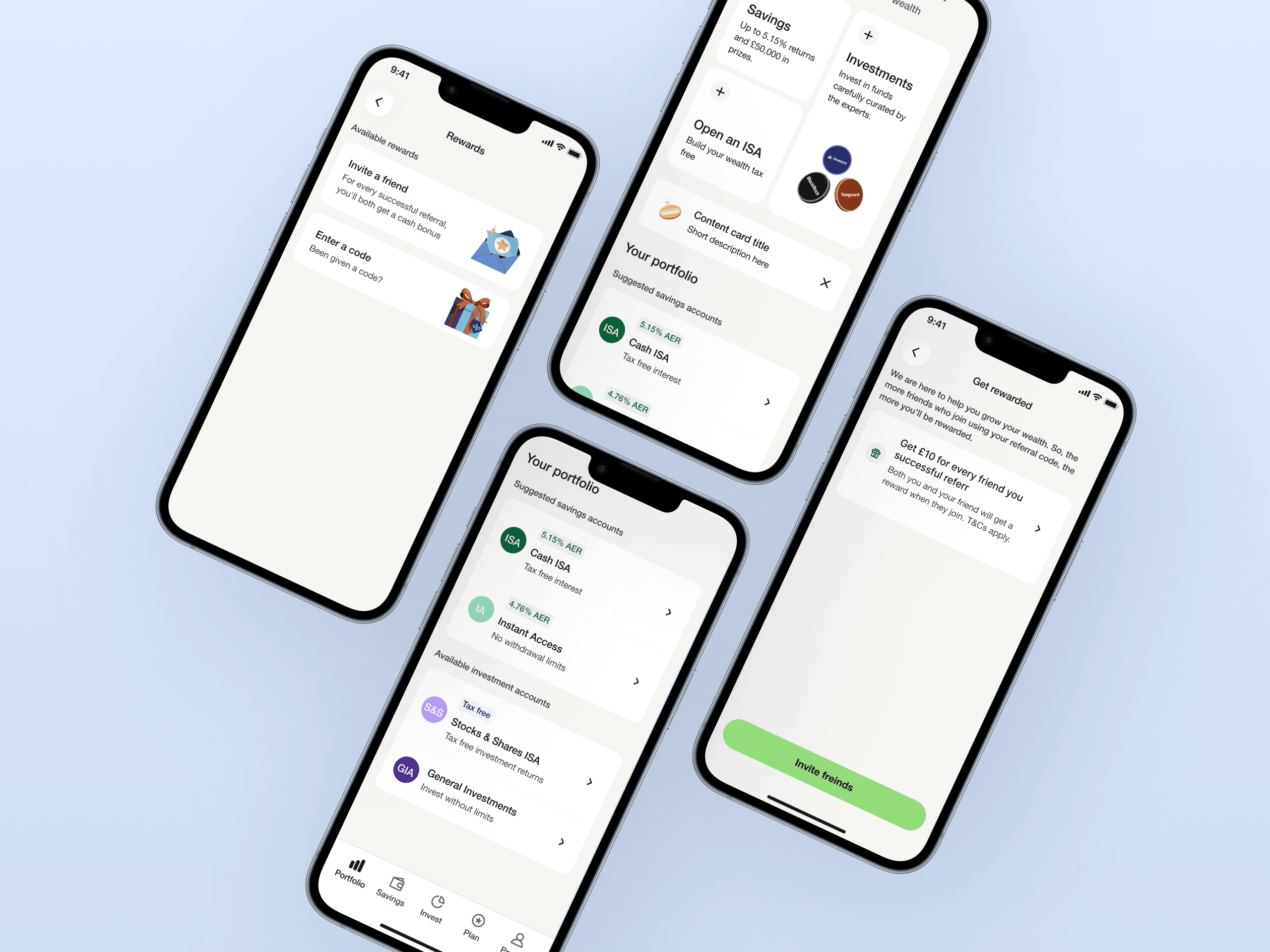
Scalable design system
My role
Design System Designer
Deliverable
Tokens, library and docs
Platform
Mobile (iOS & Android)
Core challenge
As the product grew, the UI started quietly falling apart. Designers were solving the same visual problems repeatedly buttons, inputs, cards, modals with slightly different decisions each time. Developers were doing the same in code, implementing components independently without a shared reference. The result was a product that had drifted into inconsistency, a handoff process held together by verbal explanation, and a codebase accumulating debt with every new feature.
- No single source of truth for styles, components, or patterns
- Multiple conflicting versions of the same components across screens
- Designers rebuilding from scratch on every new feature
- Developers reimplementing components already built, just slightly differently
- Handoffs that relied on verbal explanation rather than documented standards
- UI that was becoming increasingly difficult to scale without regression
- Established WCAG-compliant design systems and improved design-to-development handoff efficiency by 35%.
Mindset
Before designing a single component, I ran a full UI audit — cataloguing every distinct variation of buttons, inputs, typography treatments, and colour usage across the product. This gave the team a shared, undeniable picture of the problem and a prioritisation framework: the highest-frequency, highest-drift components were built first.
Getting developer buy-in early was critical. I ran a working session with engineering before building anything, aligning on token naming conventions, component prop structures, and documentation format. The goal was a system developers would actually reach for — not one they'd route around.
"Design system work fails when it's treated as a design-only initiative. The earliest conversations should happen with engineering and shouldn’t be an afterthought."
Problem
The product had no shared source of truth, and it showed. Three major breakdowns were driving the dysfunction:
No single source of truth
Designers were rebuilding from scratch on every new feature. Developers were reimplementing components that already existed just slightly differently. Every screen was a negotiation.
Compounding inconsistency
Multiple conflicting versions of the same components lived across screens simultaneously. The more the product grew, the harder it became to course-correct without regression.
Handoffs that relied on context, not documentation
Without written standards, every handoff depended on the right person being in the room. Knowledge walked out the door whenever someone did.
Solution
A system built in layers, from primitives to documentation each layer reducing the decisions that needed to be made from scratch.
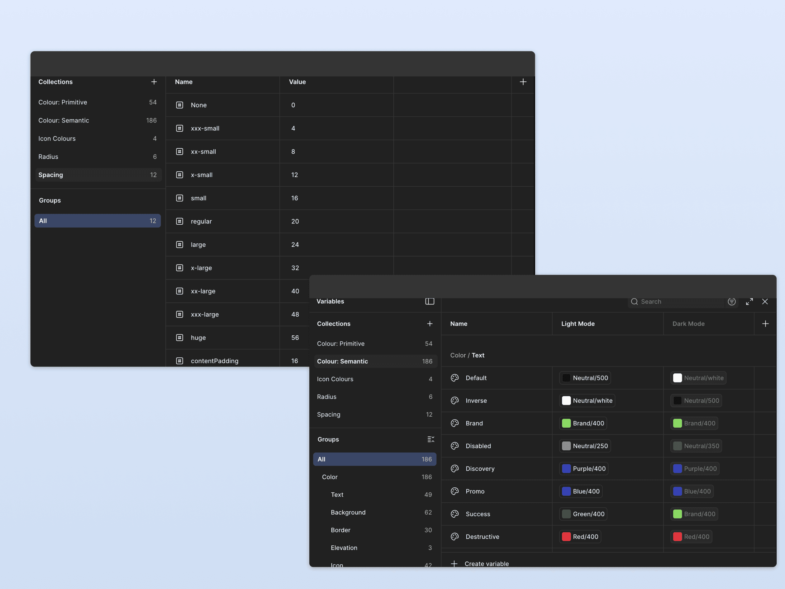
Design tokens, the primitive layer
Before touching a single component, I defined the primitive layer: colour palettes, typography scales, spacing units, border radii. These tokens became the single reference that both Figma and the codebase pointed to. A change at the token level propagated consistently across the entire product, rather than requiring manual updates across dozens of files.
Component library variants-first architecture
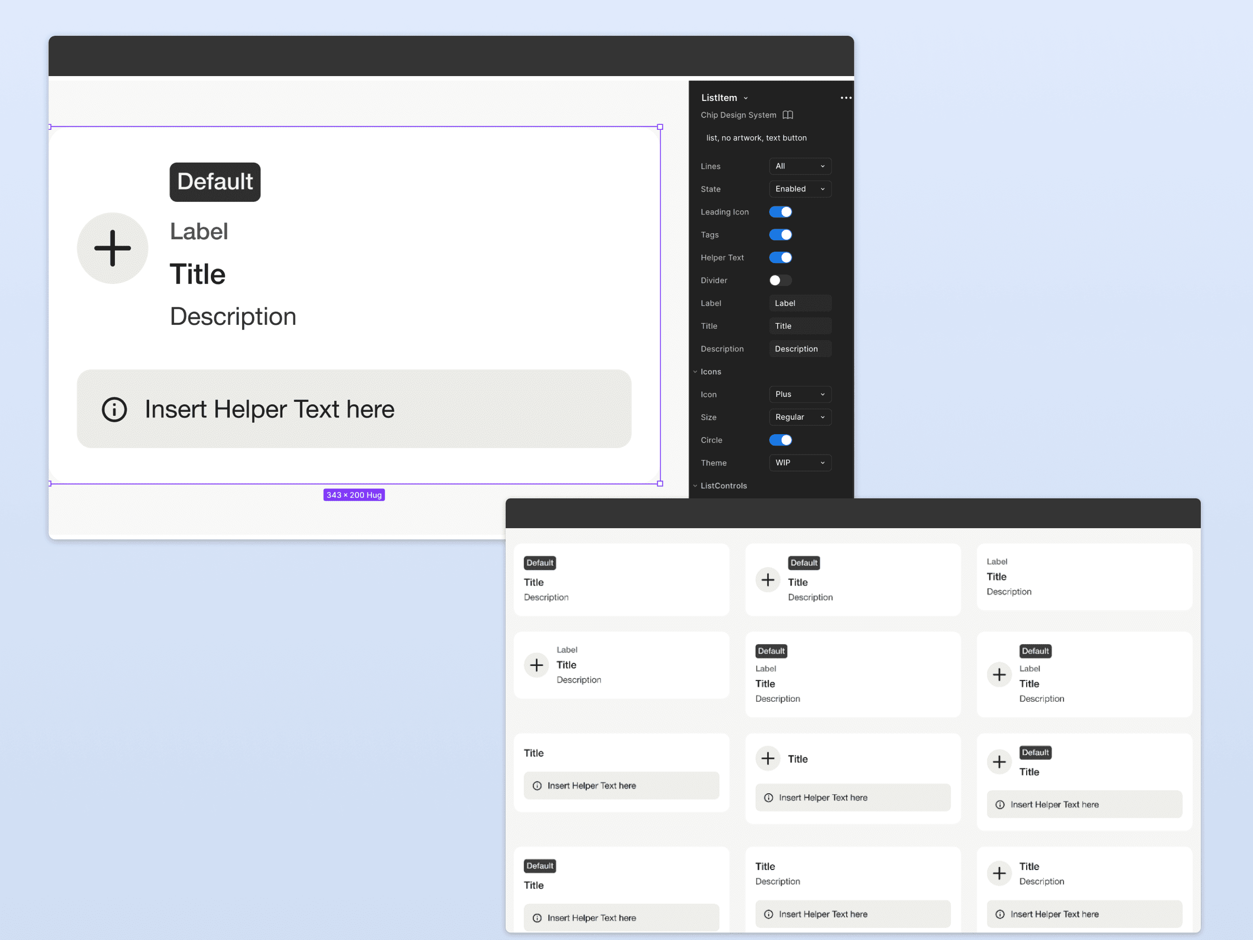
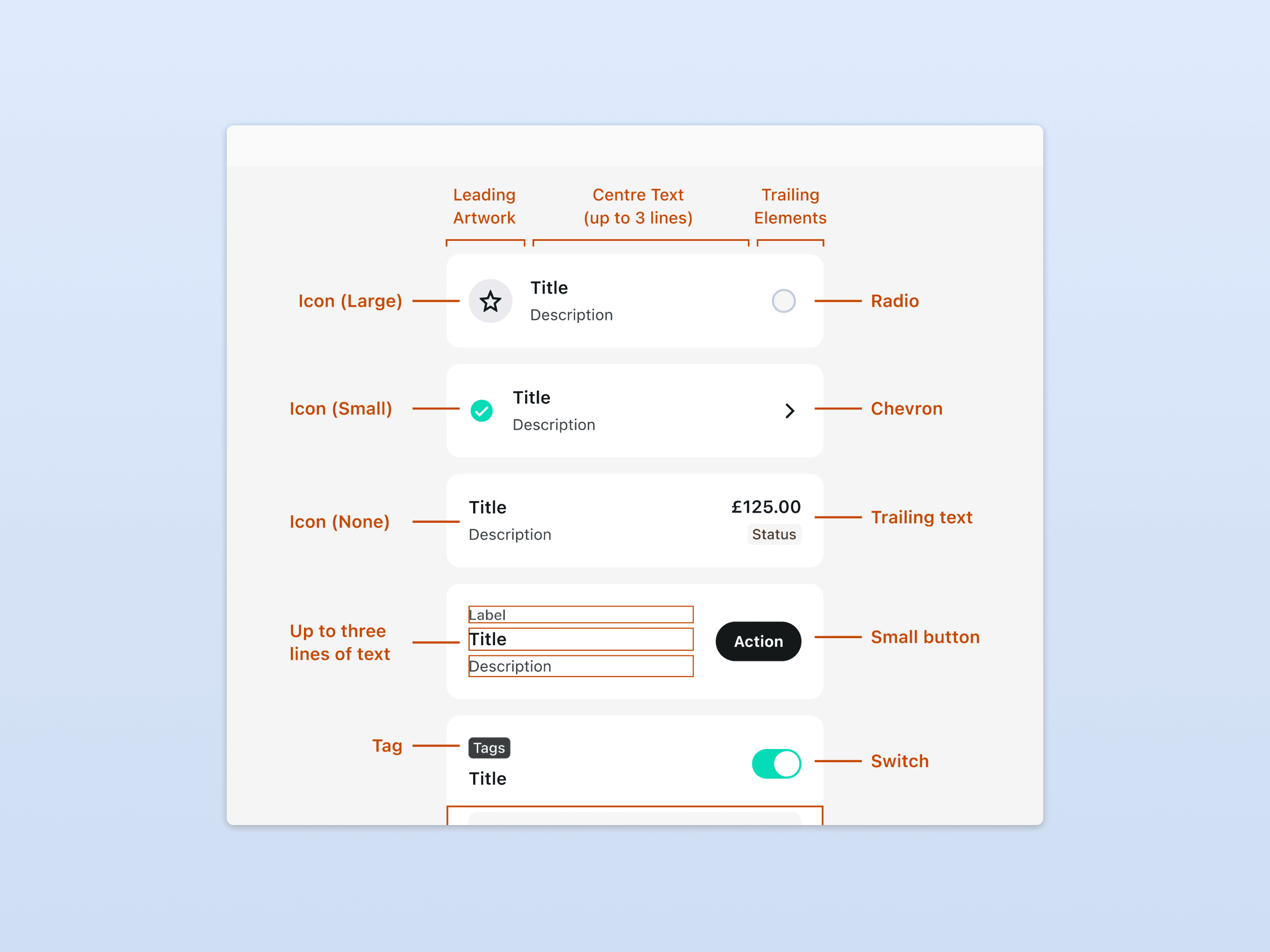
Each of the 100+ components was built with a variants-first mindset. States, sizes, themes, and interactive behaviours were contained within a single, well-structured component — not scattered as separate, disconnected instances. This was the primary lever that eliminated duplicate components: one component with clear variant controls, instead of ad hoc copies modified per screen.
Before & after the clearest proof
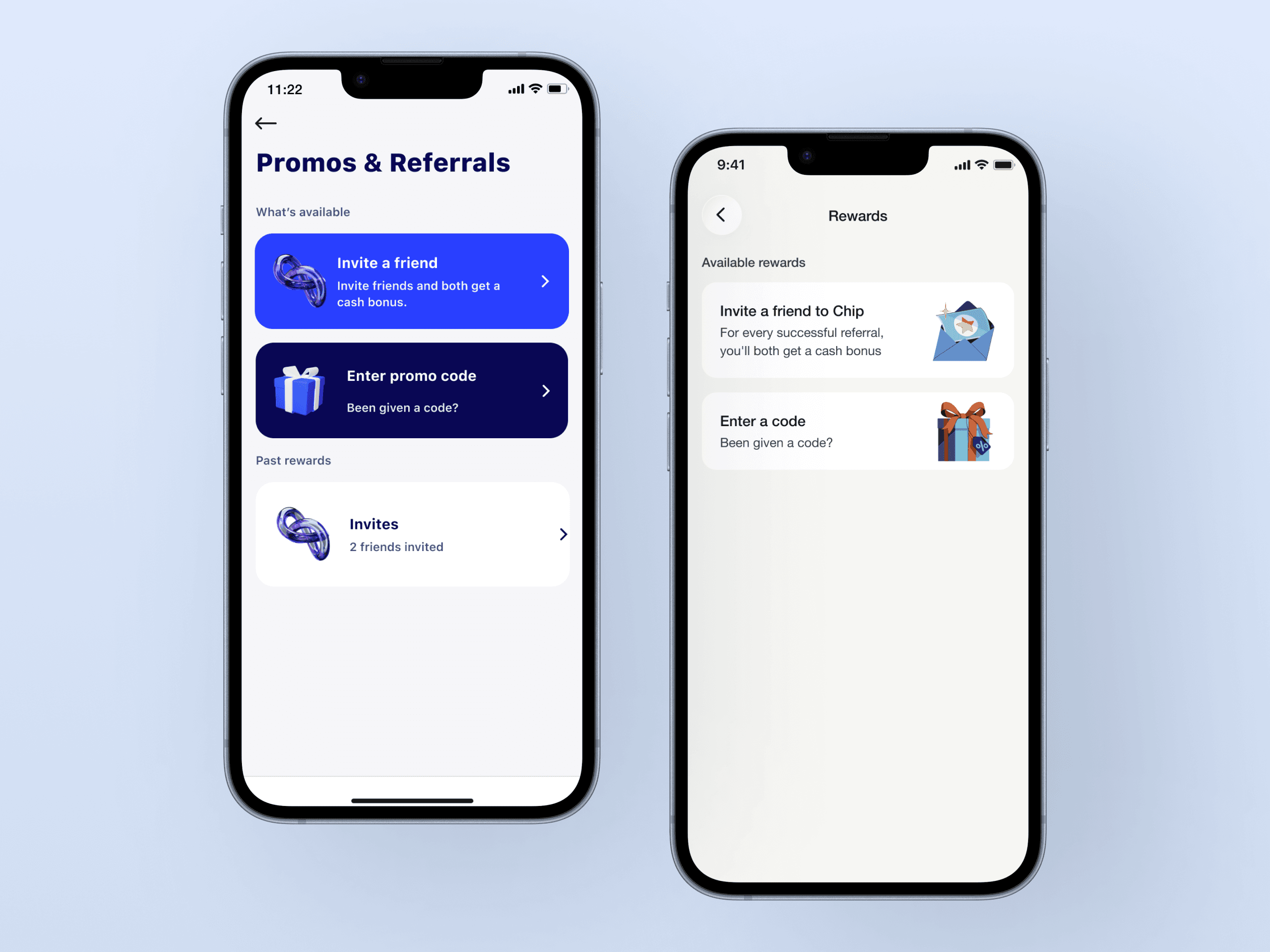
The most direct way to communicate impact: screens from the same feature, before and after the system. The before state shows the fragmentation — mismatched spacing, inconsistent button styles, typographic drift. The after shows what a shared language produces without any extra design effort.
Documentation the handoff layer
Every component was accompanied by usage guidelines: when to use it, when not to, accepted variants, and accessibility considerations. Rather than explaining components verbally in every handoff, developers could reference the documentation directly. This meant engineering effort could focus exclusively on new components not rebuilding existing ones from scratch.
Result & impact
The system established WCAG-compliant standards across 100+ components and improved design-to-development handoff efficiency by 35%.
Developers stopped rebuilding existing components. Designers stopped making the same decisions twice. New screens are now assembled from existing components the output looks more consistent without extra effort, because the system does that work.